CROSSROADS DENTAL
Dental Office Design
This project received the 2009 Interior Design Institute of BC Design Award
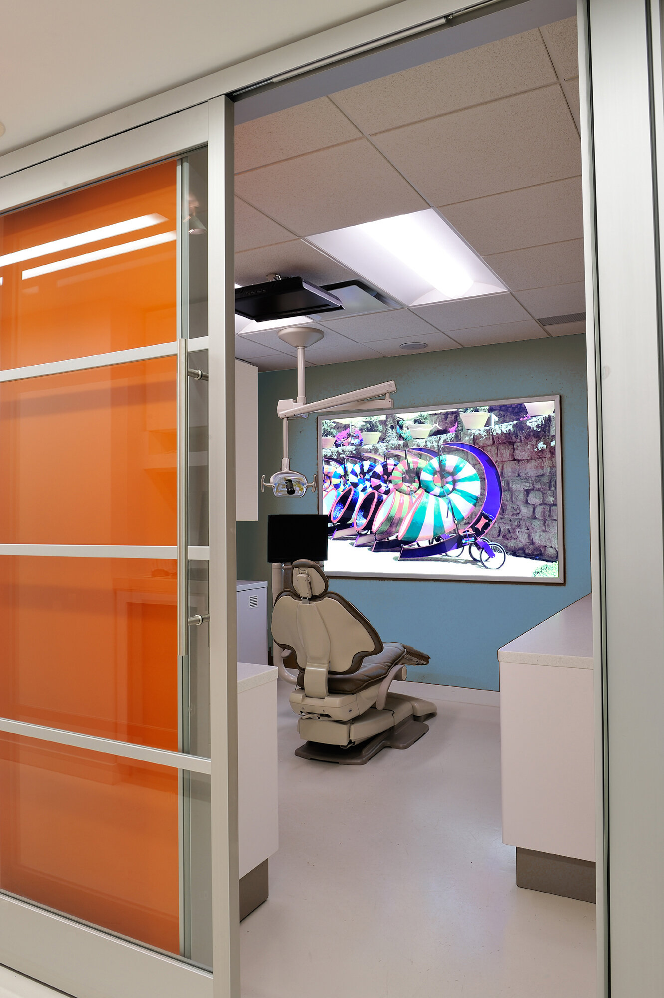
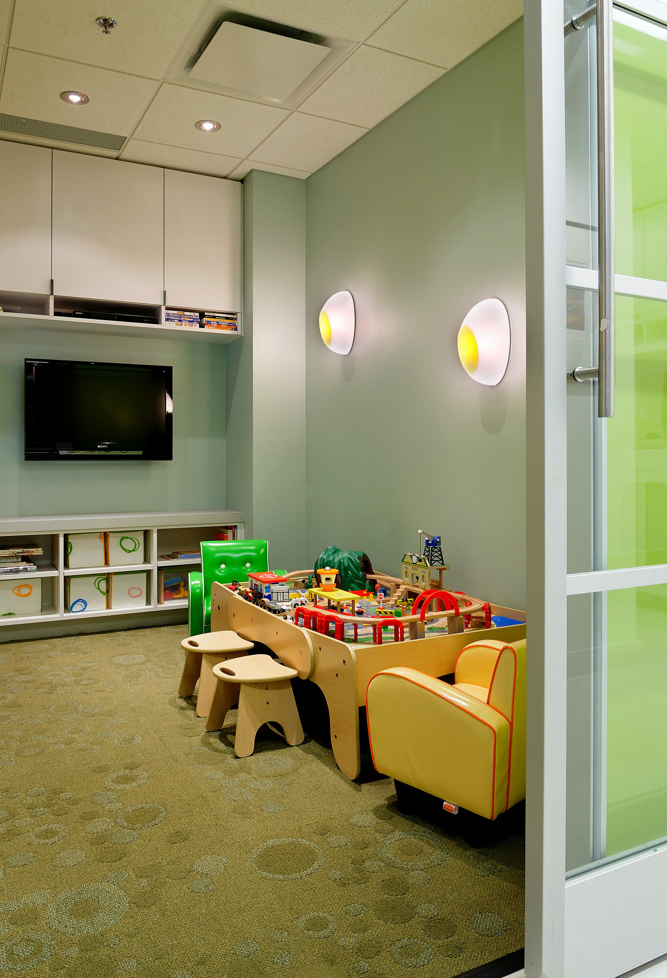
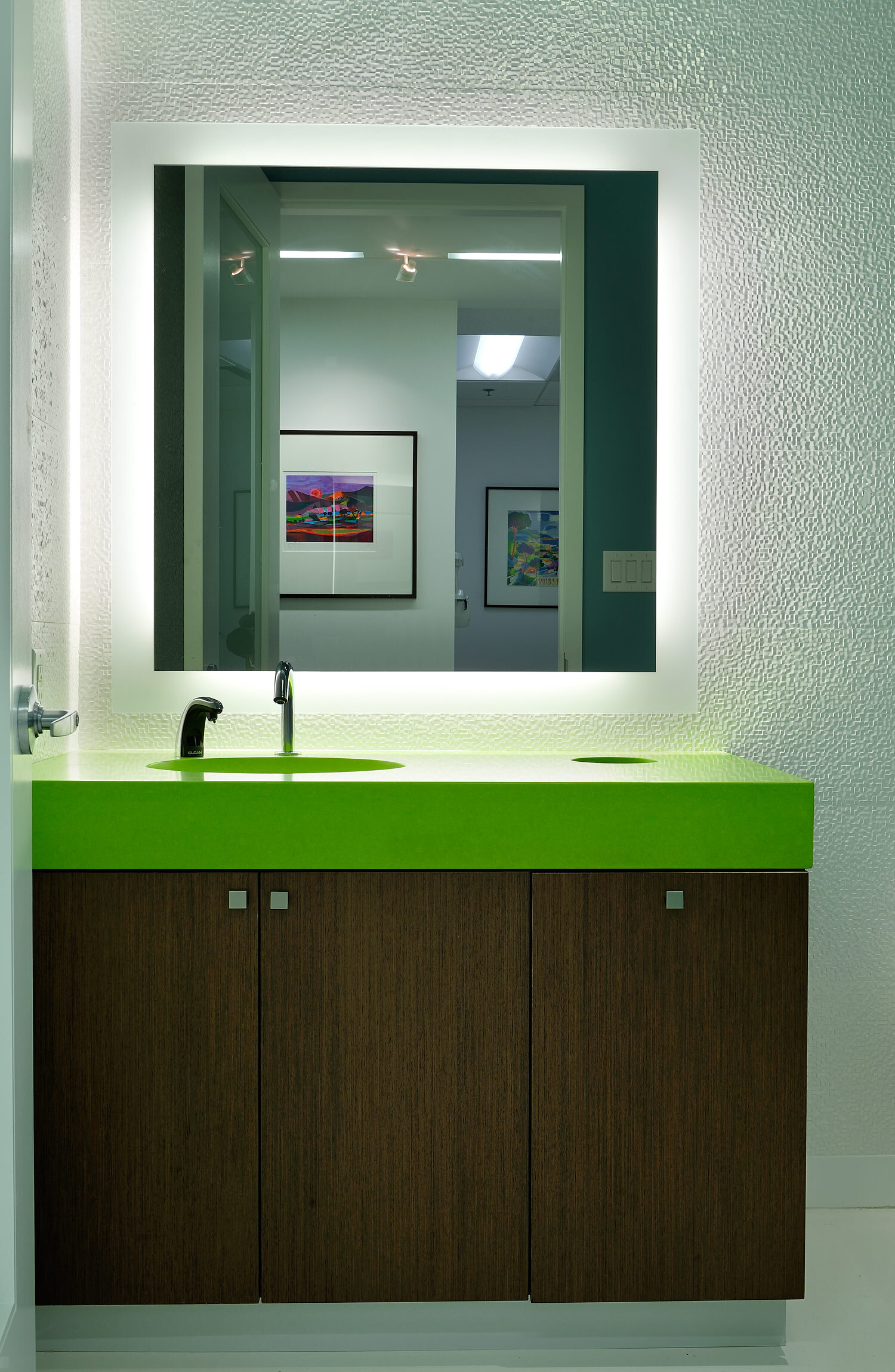
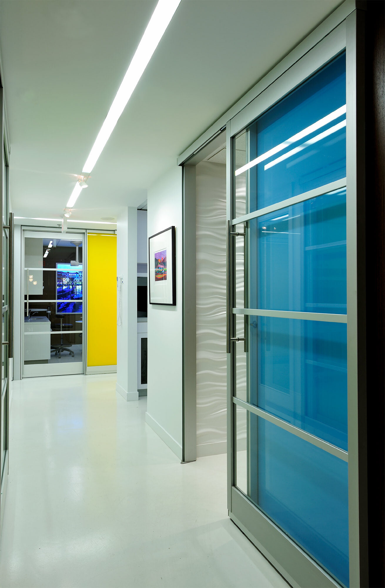
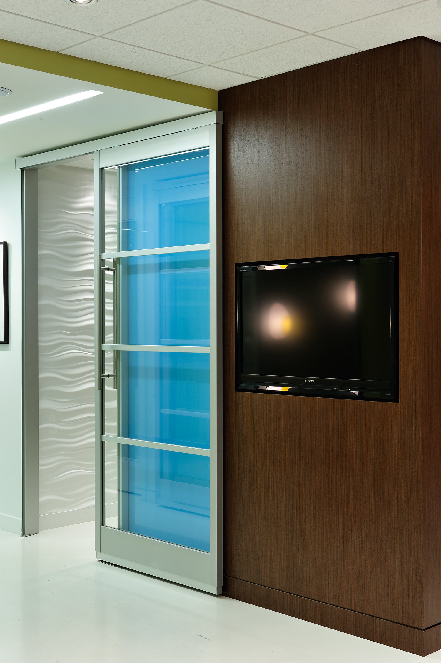
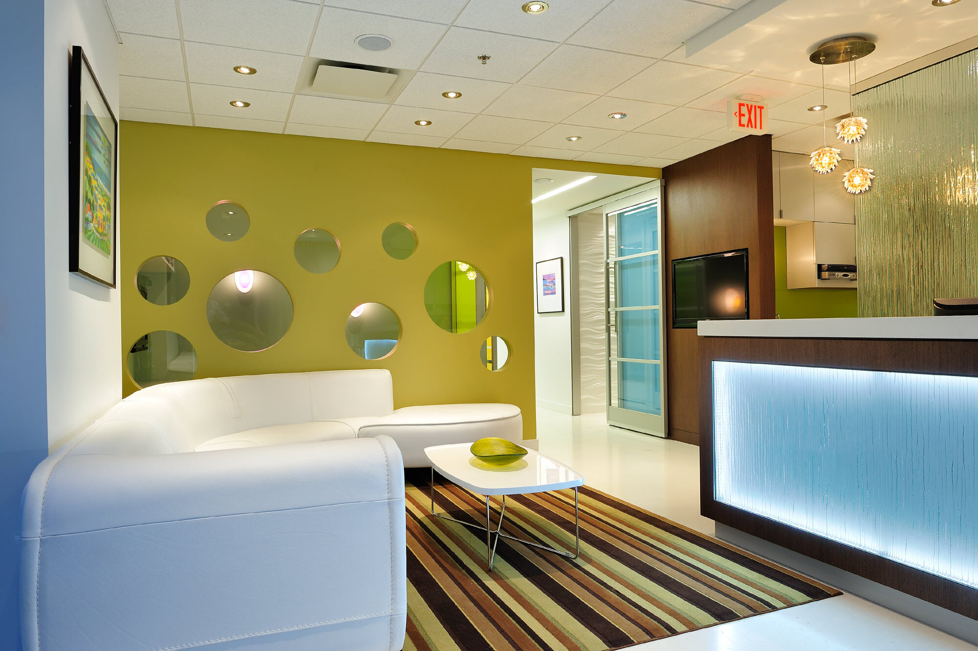
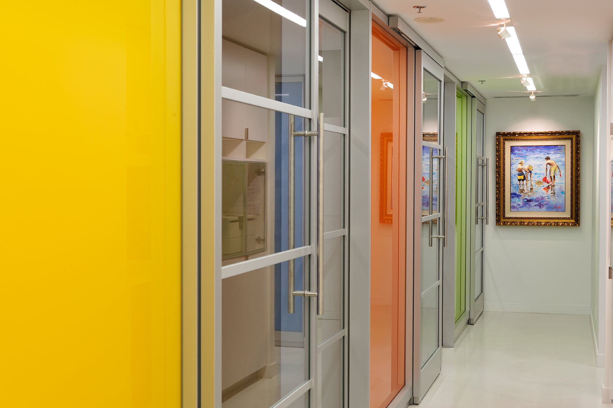
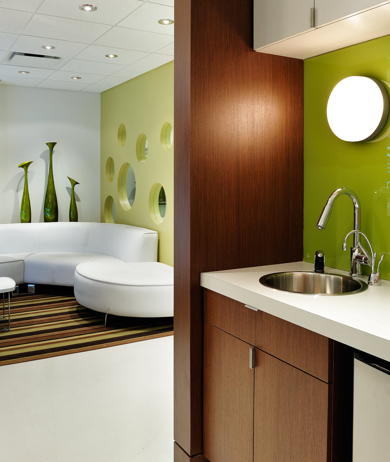
Our client desired a fresh, modern, and clean looking office interior design for the new location of his dental practice. To encourage light into the windowless rear exam rooms, we designed a brightly colored glass wall system with sliding doors along the back corridor. White concrete floors, stainless steel, rich anigre’ wood, and bright accent colors create a modern and uplifting environment for the staff and their patients. The dentist wanted a separate kid’s play area next to the waiting area so the parents can supervise, so we provided portholes in the wall between the spaces. The dentist’s personal travel photos were framed and backlit in each exam room.
“Angela was the savior of the Crossroads Dental project. Prior to Angela being hired, the consultancy, coordination and design were very much “off the rails” until she became involved. As the building owners, we very much sighed with relief when a “professional” got involved -- the difference was clearly obvious and the results speak for themselves. We feel the tenancy design is the best at Crossroads and we hope you win some industry awards for your vision and execution, plus maybe some humanitarian awards for navigating such a frustrating project. Good work – congratulations.” — Andrew Adams, Project Manager, PCI Developments
